Increased paying subscribers for a digital medical ID service
Role
UX Researcher
Team
2 UX Researchers
Time
14 weeks
Contribution
Heuristic analysis, Study plan, Interviews, Analysis
Stakeholders
Vitals CEO, Vitals CMO
Deliverables
Heuristic evaluation, Personas, Task analysis, Interview insights, Design recommendations
Vitals is a digital medical ID service struggling with a low conversion rate

The Vitals™ app lets families create profiles for vulnerable loved ones.
Each profile contains critical information about medical conditions, behaviors, and care needs that helps first responders provide appropriate support.
Despite its usefulness, 92% of users don't subscribe after signing up, highlighting a retention challenge.
Research methodology
Research Goals
Explore barriers to service adoption
Identify technical and usability issues
Understand real-world user friction points
Who We Studied
Inactive Vitals users
Diverse demographics (age, race, ethnicity)
Various tech proficiency levels
Different emergency service experiences
Mix of roles (patients, caregivers, both)
How We Learned
User interviews with think-aloud app testing
Discussions about service adoption interest
Heuristic evaluation of critical flows
Key Issues & Solutions
Our research revealed three critical barriers in the signup process. Each finding led to a targeted solution that would significantly improve the user experience.
Building Initial Trust

Pain Point
70% of users expressed concern about sharing personal information without understanding the app's purpose and functionality. The static sample profile failed to provide adequate context about the service.
Solution
Make help options readily accessible throughout signup, including FAQs and support contact to build trust through transparency and easy access to information.
As users move forward to create their account...
Streamlining Data Collection

Pain Point
The multi-step form created friction by:
Collecting all personal information before showing plans
Not validating existing accounts early enough
Showing password criteria only after submission errors
Solution
Break down bio-data collection into smaller steps with clear explanations for data usage, helping users understand why each piece of information matters.
With their information submitted, users arrive at the crucial decision point...
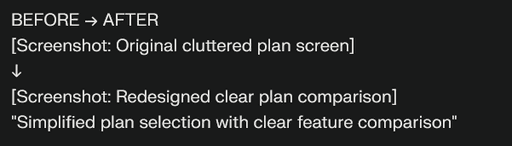
Improving Plan Selection

Pain Point
Users struggled to compare plans due to:
Having to navigate between screens and memorize details
Unclear terminology in plan descriptions
No upfront indication of plan availability in their location
Solution
Redesign plan display with simple language, location-based availability, and comparable features in a clear, structured format to enable informed decision-making.
These solutions address the most critical barriers in the signup journey. Our research uncovered additional opportunities like improving visibility of free trials and adding a plan recommendation quiz, which could enhance the experience in future iterations.
Outcome
Our recommendations were validated through implementation in the new Vitals app, demonstrating their practical value.
While the service later ceased operations due to funding challenges, the research insights remain valuable for similar healthcare technology solutions.
Personal Impact & Growth
This project transformed how I approach UX research. I learned that expertise can sometimes be a blind spot – I was so comfortable with technical terms and signup flows that I missed seeing them through a beginner's eyes.
Now, I consciously step back and ask, 'How would someone experience this for the first time?'
Growth Areas
🔍 Research Mindset
Embracing beginner's perspective
Questioning assumptions
👥 Professional Development
Collaborating with C-suite
Balancing user & business needs

